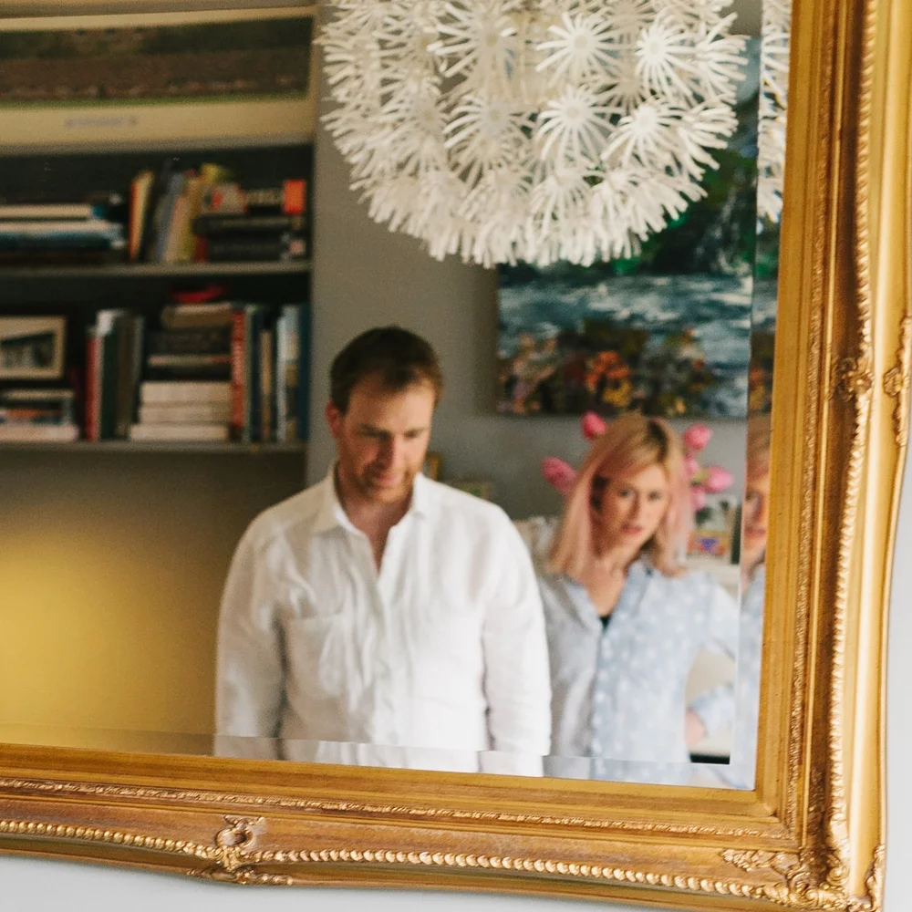
When we stumbled upon Bo Fentum’s stunning house on Instagram we knew we had to find out more about the lady behind the leopard print walls. Bo studied interior design at Chelsea College of Design and, after graduating last summer, set up her own company, specialising in residential interior architecture and design. We talked to her about leopard print’s trashy phase, finding the perfect pink, and, of course, whether she dresses like she decorates…
The fabulous Bo Fentum on her fabulous sofa
How would you describe your dress style?
Eclectic and colourful! I shop vintage, high street, and independent so tend to mix and match, but it’s always colour that catches my eye, so I usually buy based on that. I love wearing colourful shoes and jewellery. And I find it hard to resist a bit of leopard print – it can often stray into Bet Lynch territory but I love it!
How would you describe your decorating style?
I’m a huge fan of mid-century architecture and design with its clean lines, clear function and contrasting materials. I love the mantra ‘form follows function’ and always try and understand a space before I start designing. Homes are to be inhabited and enjoyed so the interior design should enhance the space and create a feeling of harmony.
Does the way you dress affect the way you decorate, and vice versa?
Yes, for sure. I love pops of colour around the house and do the same with outfits.
Leopard print AND pink! Yes please!
Bo’s leopard print study papered in Albany’s Big Cat
Let’s talk leopard print. It’s a key feature of your home and of your wardrobe, can you talk a bit about your love for it?
Ah, lovely, lovely leopard print! It’s such an enduring print that just makes me smile. I can’t even remember a time where I didn’t wear it in some capacity, such is the love. It’s been through its classy peaks and trashy lows, but it’s always there. I took the plunge and wallpapered my office in Albany’s Big Cat last year and it is utterly bonkers brilliant. Now I’m surrounded by it all day - bliss!
How do you approach a blank space? Do you moodboard colours and prints beforehand, or just pick up the paintbrush?
Concept, research, and development. Having studied interior design, I’m aware of the importance of allowing time for good design to develop. I often have a concept of an idea and can be quite instinctive with a design, but I will still follow a process to allow development and testing. Mood boards are a great way to test materials and colours but just as important is spatial arrangement and configuration. 3D drawings really help with understanding a space and visualising, so that I (and/or the client) have confidence with a design before committing.
Bo advises, ‘Start small. You can build up colour in your home over time.’
You’re a fellow pink lover. How can we convert the world to our way of, er, pinking?!
The wonderful thing about colour is there’s a shade for everyone, and it’s certainly true of pink. It can range from the most sugary pastel, right through to the boldest neon, so I would say to anyone who wasn’t sure about it – you just need to find your shade! [ED: There’s a fun quiz to find out ‘Which pink suits your personality’ in my new book Pink House Living.] It really is the most fun colour. It has the ability to be super sophisticated and understated, or bold and daring. Used in conjunction with another colour will dramatically alter it too. A good tip when trying testers is to paint a couple of A3 size paper sheet in each shade and stick them on the wall in different areas – one near a window and the other far away. Then watch it for a few days to get a sense of it day and night.
Lots of people are bolder in their fashion choices than with their homes. What would you say to people who want to use colour and print on their walls but don’t know where to start?
Start small. You can build up colour in your home over time, allowing your confidence to grow with it. I recognise not everyone feels able to just ’take the plunge’ when it comes to going all out so just start slow. Ultimately, nothing can’t be undone, but you’ll never know what you could have unless you try.
Do you think your interiors style is different now you live in London? Do the places we live affect our decorating?
I think where you live and also the style of home you live in can definitely inform design. I live in a 1970s townhouse in London and it definitely influences how I decorate it. I buy vintage furniture in keeping with the era and mid-century ceramics to accessorise. The rooms are large and have big windows but, being a 70s house, it didn’t come with any ‘features’ so I like to use bold colour or pattern to give the rooms identity.
Bo’s colourful kitchen in her 1970s London townhouse
Who or what do you look to for interiors inspiration?
I’m hugely inspired by architecture, particularly modernist architecture. I love the considered use of materials and the ethos of ‘form follows function’. I always look at the use of a space above everything first when designing. It is easy to be wowed by surface aesthetic, but establishing a space’s function helps inform a design. Although not a minimalist, I also love interiors to be uncluttered. I err on the side of less is more, allowing key pieces to be prominent rather than lost among a sea of stuff.
Another big influence is nature. I’m a big fan of house plants as they are the perfect combination of form and function. Their organic shapes soften an interior, bring colour, absorb sound (especially great for open plan spaces) and filter the air. What’s not to love about that?
That velvet sofa looks SO comfy!
Thanks so much Bo! You can follow Bo (and her beautiful house) on Instagram and on Pinterest. If you’re interested in Bo’s services as an interior architect and designer, get in touch via her website.
All interior images taken by Chris Snook.
Bo’s headshot was taken by Image Bliss Photography.


