BEFORE: A vision in beige
My eldest son Oscar is a lucky little (insert inappropriate term of abuse here): of all the bedrooms in The Pink House, his has the best view.
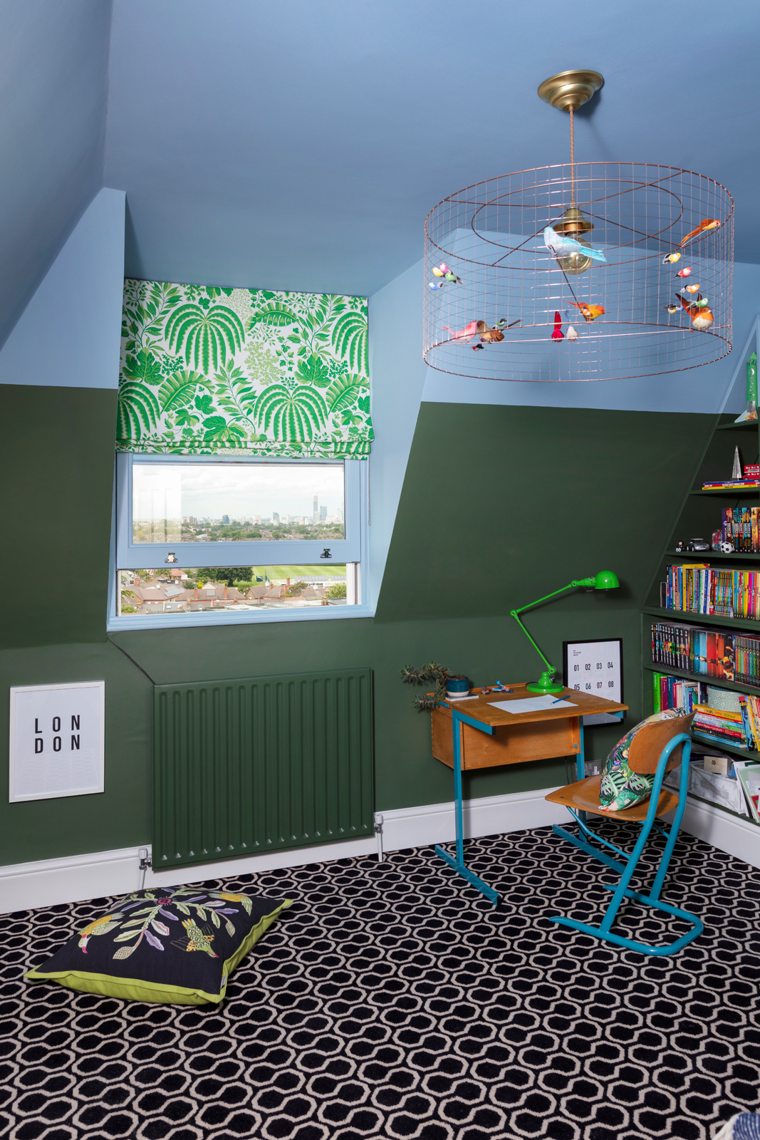
From his bedroom on the second floor of our south London hilltop looking north over the city, you can see all the way to the Houses of Parliament to the west, across the skyline to the London Eye, Shard, Walkie Talkie, Gherkin, Canary Wharf and the O2, and watch the planes landing at London City airport in East London.
So when it came to designing Oscar’s room, its location, perched high above our incredible city, was a key consideration. I wanted to reference the city beyond his window, but balance the urban with the presence of nature - the wonderful woodland adjoining our back garden is the main reason we bought our house, and what makes living here extra special, so I wanted to reflect that in Oscar’s room.
Let me now take you through my design process step by step, so you can see how the room came together, and how the decisions were made (spoiler: Oscar wasn’t really involved, but he still gives his room a 10 out of 10)…
The lucky little b***er’s birds-eye view of London
Step 1: The blackout blinds
I chose the Urban/Jungle theme for Oscar’s bedroom right after we moved in and had to get blackout blinds made for the boys’ rooms as a matter of urgency. Because 3.30am is not a sensible time to start the day. I knew I wouldn’t get round to properly designing and renovating their rooms for quite some time, but I didn’t want to waste money on having to replace their blinds when the renovations did finally happen. And so the roman blind fabric was the starting point for the whole room.
Oscar is a big fan of the colour green and loves watching David Attenborough wildlife programmes, so when I suggested we brought a jungle vibe into his room he was keen. I let him choose from a (very limited) set of samples, and managed to persuade him that his favourite was also mine: this vibrant green "‘Rainforest’ design by Sanderson, which I’m sorry to say has now been discontinued. Waikiki linen in Green on Oyster by Bennison Fabrics is similar.
Step 2: Sort out the storage
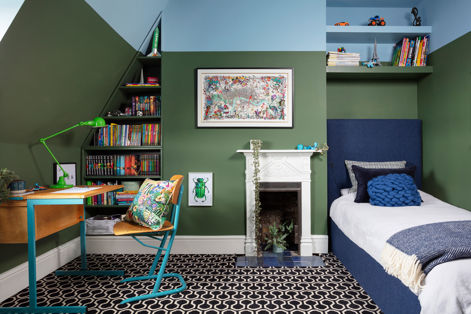
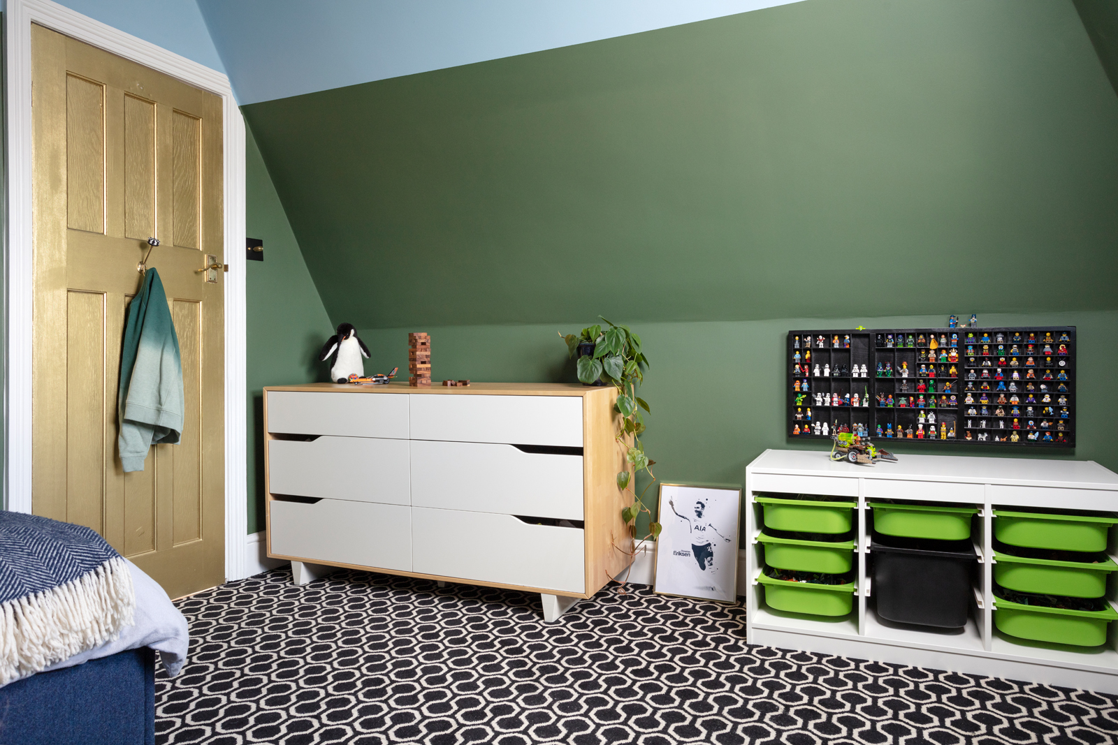
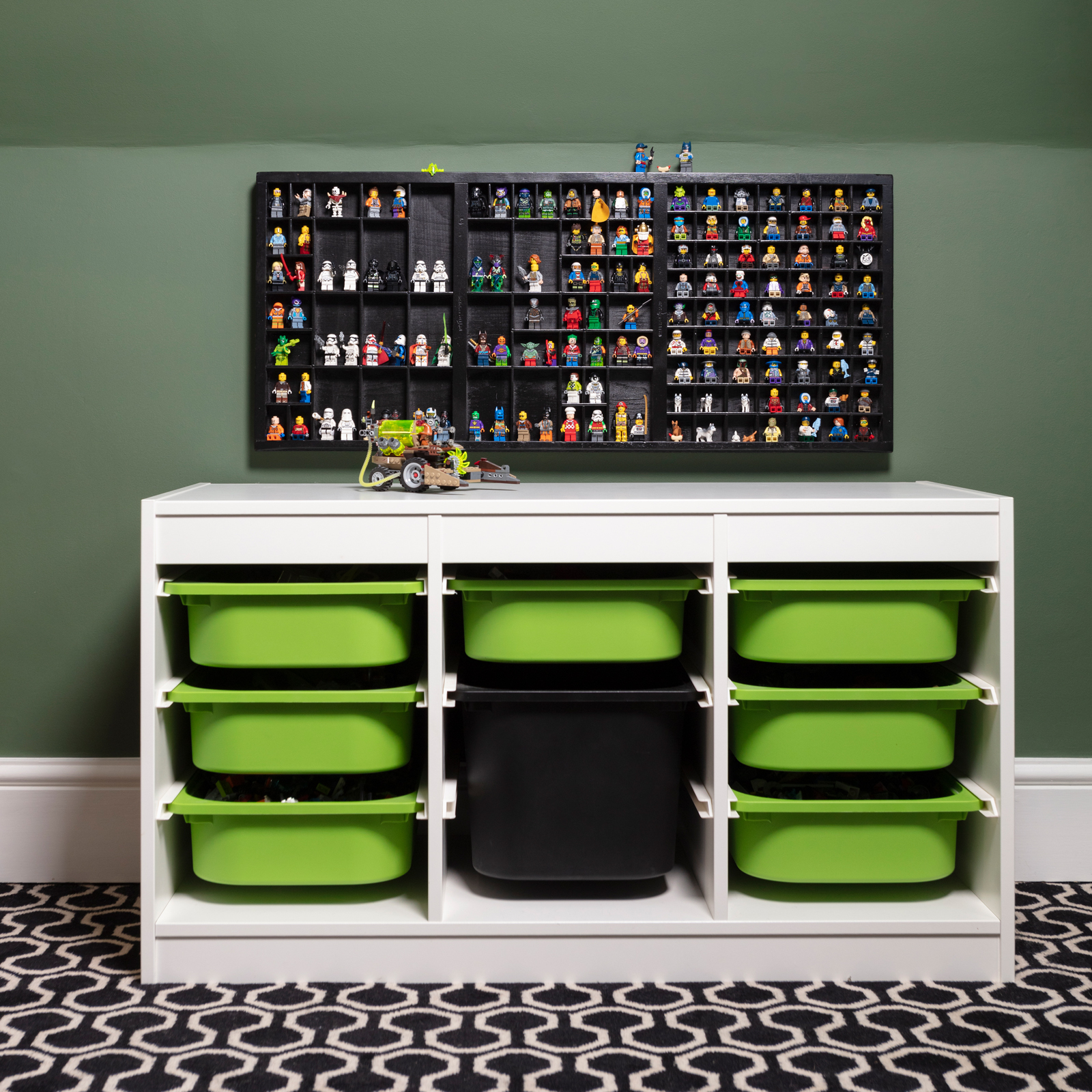
The items of furniture we already had were an Ikea chest of drawers and ‘Trofast’ Lego storage system with green and black boxes. Luckily, the green worked with the jungle colour scheme concept, and cemented my decision to use two shades of green in the room - a darker, foresty colour on the walls, with pops of brighter green.
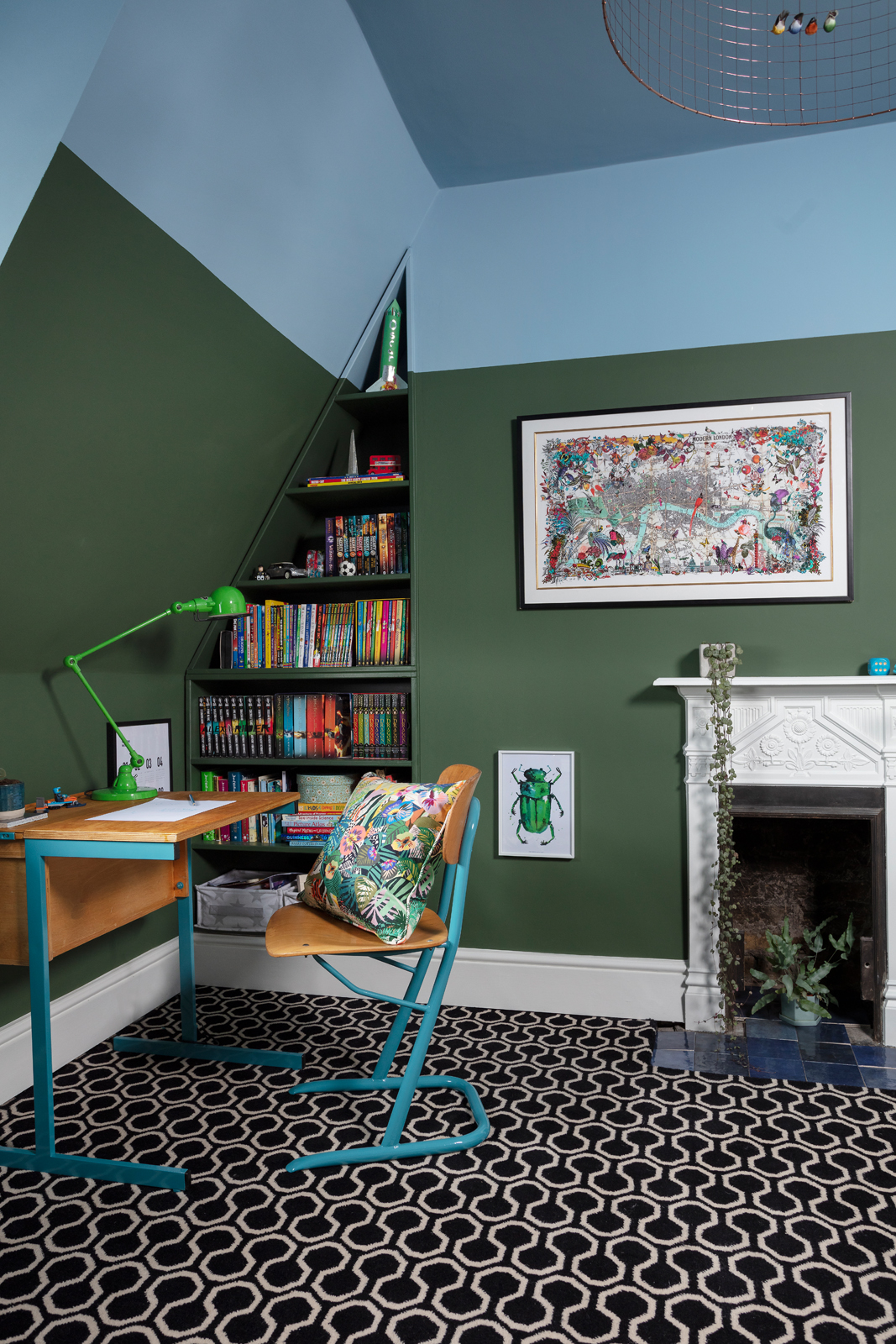
But we still needed more space for books, stationery, more Lego, etc. I’ve said it before and I’ll say it again: bespoke, paintable MDF shelving is worth its weight in gold. For a room like this one with awkward nooks and crannies it’s especially useful. So we got out favourite local carpenter, Lee from Freeborn Carpentry, to build shelves to fit the alcoves.
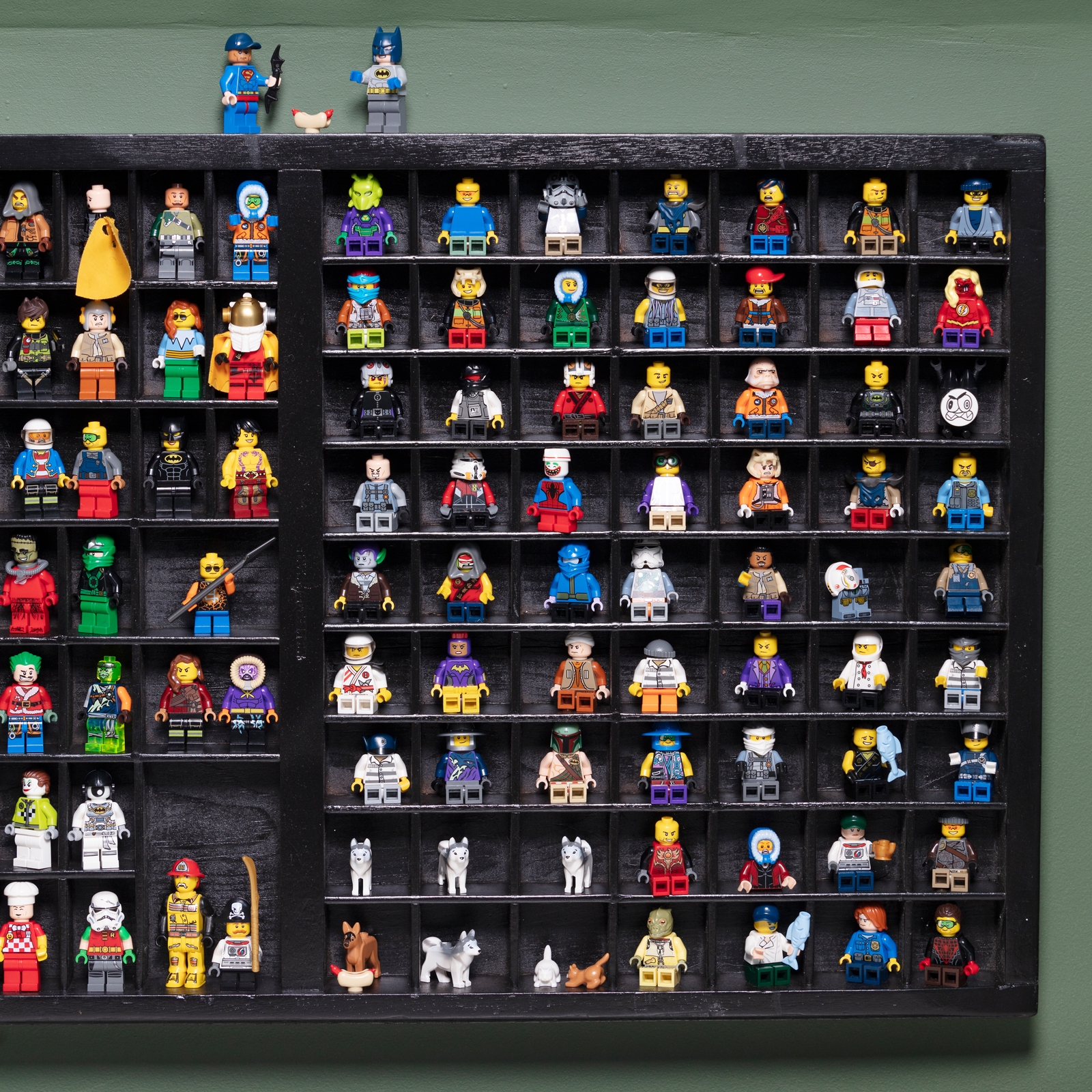
Finally, I asked my luxecycling genius friend Zoe, whose Muck n Brass studio is just down the road, to paint my old printer block shelves black, as I thought they’d make a great place to display Lego mini figures.
Step 3: Change the bed
When we first moved into this house we bought a high-level Ikea bed with a built-in desk underneath for this room. The intention was to maximise the space in this relatively small room with its sloping ceilings, but in fact Oscar never used the desk and the bed was so high it was no use in the daytime as a place to sit and chill out. It was also a barrier to those all-important bedtime cuddles. So when sofa.com approached me to see if I’d like to collaborate, it was the perfect opportunity to find a bed that not only made the most of the room, but would also suit Oscar into his teenage years and beyond.
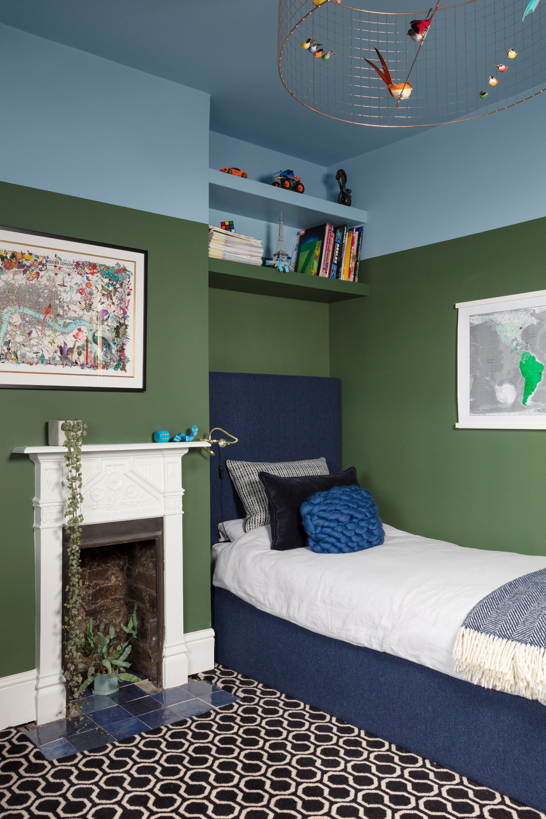
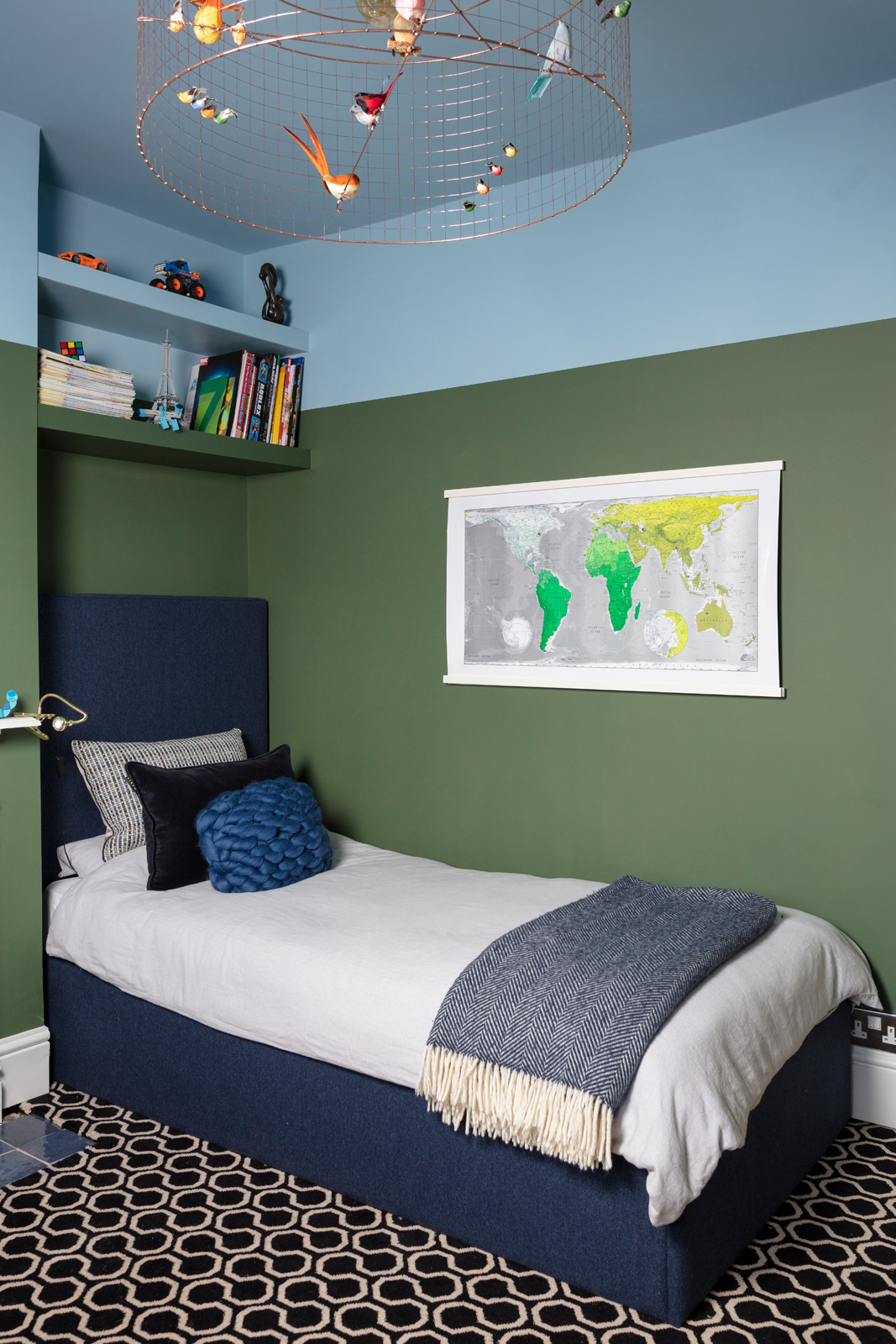
The sofa.com bed he and I chose - the Harlow single bed, upholstered in Twilight wool marl - is ideal. There’s loads of storage under the easy-to-lift frame, so bulky duvets, covers, sheets and other large/unseemly items can be stashed. The high headboard is a cool-yet-comfy design statement, and the luxurious dark blue wool upholstery feels soft, looks smart, and inspired my idea to use dark and light blues as well as greens in the room.
Now, the room feels twice as big, and the beautiful bed doubles as a sofa during the day. Oscar loves it so much he makes his bed every morning without being asked. Yes, he even arranges the cushions. That’s my boy!
Step 4: Choose the carpet
This was a crucial stage. Because not only did the flooring have to look and feel right in Oscar’s room, it also had to be appropriate for the whole 2nd floor of the house, which includes his little brother Zac’s room (which overlooks the woodland behind our house), and the landing between the two. My idea was that a patterned carpet would unite the rooms, creating a ‘boys’ zone’ on the top floor. I went on the hunt for something striking, which combined the concepts of nature and city living, in a colourway that would go with anything.
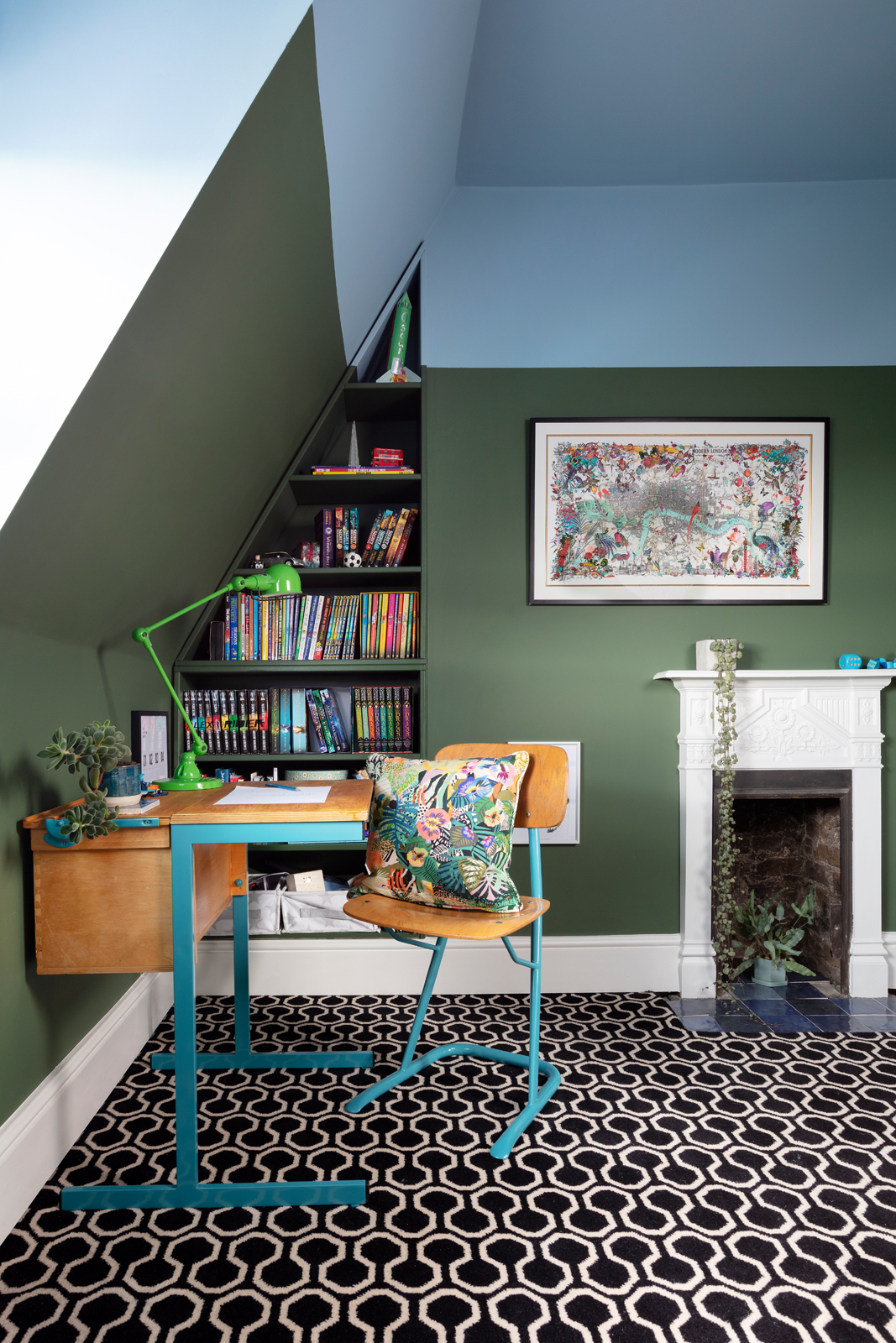
Enter Alternative Flooring’s Quirky B Honeycomb carpet in Black. If I do say so myself, this decision was genius. The honeycomb pattern evokes bees and flowers, while the geometric, monochrome design is more metropolis. And, of course, black and white goes with everything. Being from Alternative Flooring, the carpet is top quality - the 80% wool, 20% nylon mix means it’s both soft and hardwearing. Definitely a carpet that will see Oscar into adulthood. Weird to think that this same carpet that’s currently under his little size 1 boyfeet will one day be walked on by his much larger manfeet…
Step 5: Pick the perfect paints
Although I knew I wanted this north-facing room to be predominantly green, finding the RIGHT green was proving rather difficult. Until I started poring over Mylands’ paint charts, when I found it straightaway.
‘Brompton Road’ from Mylands’ Colours of London range is a rich, foresty green that’s dark enough to feel warm, calm and enveloping, and not so dark that the room becomes murky. Another reason I’m a total convert to Mylands is the extremely durable finish of their Marble Matt emulsion, which is ideal for growing children who like to play football in their bedrooms. Then there’s the bonus fact that this super-helpful family-run company is based locally to me in South East London so I can even pop down to the factory to see the paint being made and mix my own (more on this coming soon…).
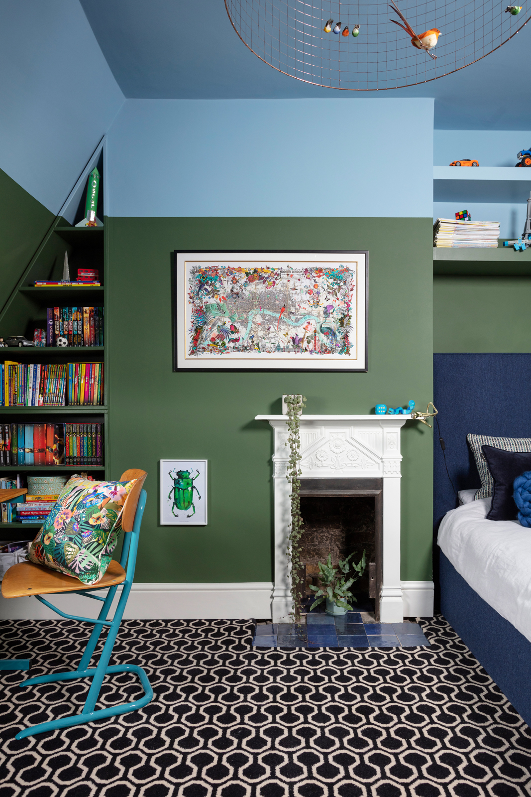
But I didn’t want to use just one colour. My vision for this sky-high room was for it to FEEL like it was up in the air. By using a sky blue paint over the ceiling and down the walls I created a horizon effect, mirroring the sky-meets-land scene outside the window. This light, clear blue also complements the darker green and bounces the daylight around the room. It’s also from Mylands and is called ‘Bedford Square’ .
Then there was the skirting and fireplace to consider. I loved how the white-painted metal fireplace contrasted with the dark grey walls in my study, so decided to do something similar here, using Mylands’ ‘Maugham White’ - a clean, serene white that feels like fresh white collars and cuffs against a smart suit.
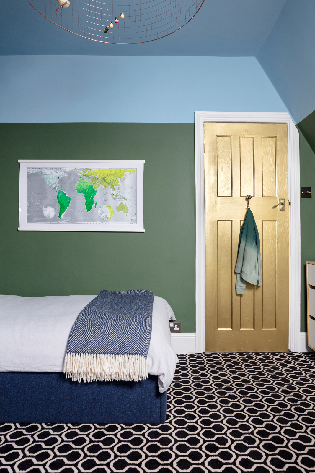
And the golden door? Oscar wanted some gold in his room (it’s his favourite colour, which I love), and a metallic door seemed the ideal solution; I used Mylands FTT-002 from its Film, Television and Theatre range. I’m so pleased with the result that I’m considering painting ALL the doors in my house the same colour…
Step 6: Find a delightful desk
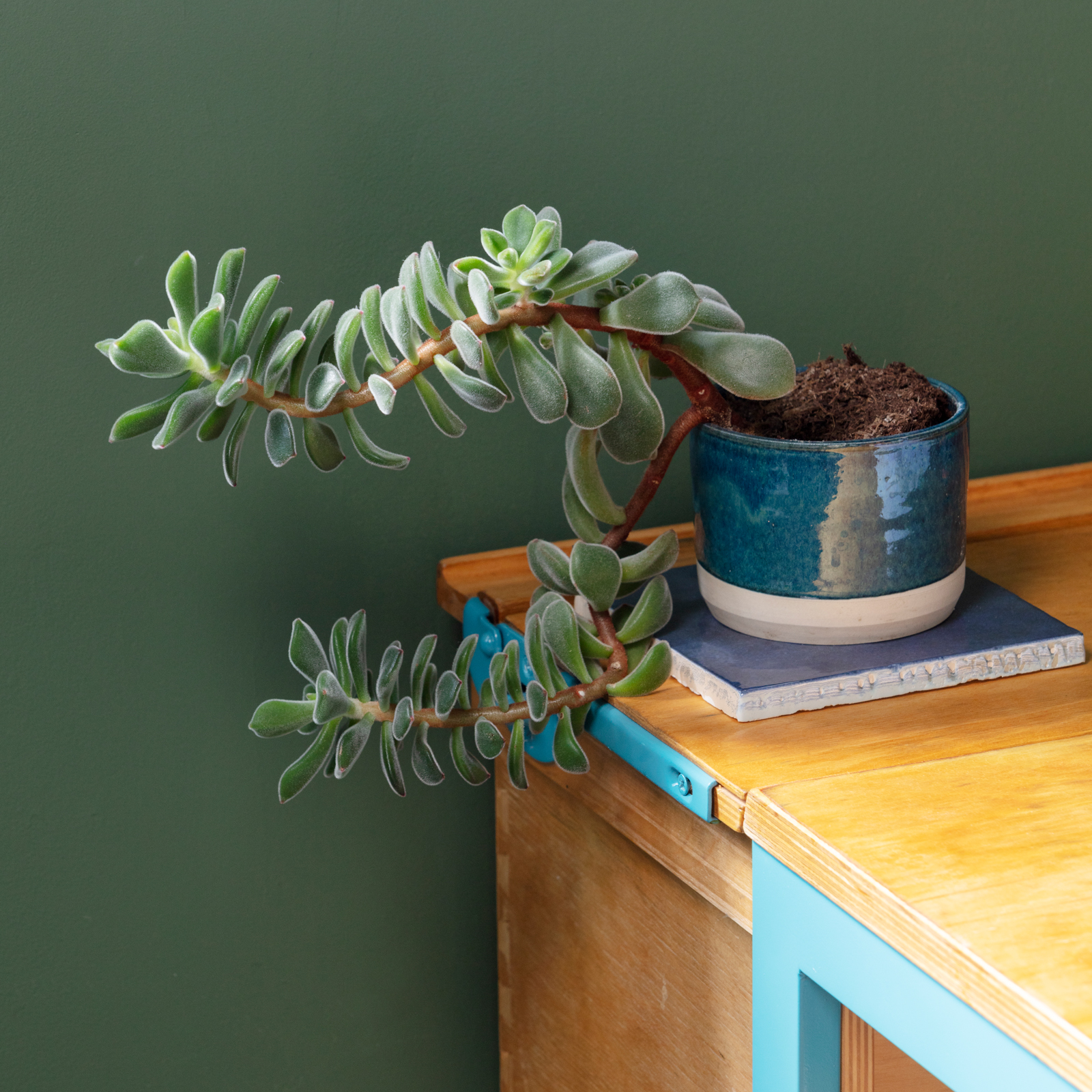
My go-to for characterful, practical children’s desks and chairs is the excellent Blue Ticking company, which specialise in upcycled high quality vintage school furniture. I chose this vintage prep school desk, which comes from a school in Surbiton, and asked Blue Ticking to paint the legs of a suitable chair the same vibrant turquoise. What I especially like about this desk’s design is the fact that only part of it lifts up to reveal storage, meaning you don’t need to remove everything on top of the desk to access the inside.
Step 7: Make the most of the ceiling
As soon as the room was painted I knew the blue sky ceiling was crying out for some birds. Specifically, a birdcage pendant from one of my all-time fave interior companies Graham & Green (whenever their new catalogue arrives I immediately want everything, which is why I interviewed owner Lou Graham - who runs the business with her husband Jamie - for my book Pink House Living).
The pendants come in two sizes and I went for the larger one, despite the fact that the room is quite small. And I’m so glad I did - I love how the birds fill the otherwise unused space and their colourful feathers pop against the blue. Oscar loves using his directional bedside lamp to make spooky shadows of the birds against the ceiling before bed, too.
Step 8: Add the accessories
With the majority of the decor complete, I could finally start finding the finishing touches that really bring the room to life. For the fireplace hearth I chose Bazaar Ceramic tiles in Colonial Blue from Ca’ Pietra. I only ordered them a couple of days before the shoot so haven’t had the chance to have them properly fitted yet, but I laid them in the hearth to give an idea of how it’ll look. More blue was added to the bed with a Romo multi weave cushion, navy velvet French Bedroom Company cushion and a chunky knit cushion I made myself at Pinterest’s annual Knitcon conference (don’t look too closely at it…). The throw is from Cox & Cox.
The light switch had to be from Buster + Punch - as I renovate I’m gradually upgrading all switches in the house to B+P. This one is the first I’ve used with a black/brass combination and it’s just perfect in this room.
The grass-green Jielde desk lamp has been kicking around our house without a proper home since we moved in, but it’s finally found its happy place on the desk, alongside the emerald beetle print from The Curious Department, who I worked with back when they were launching their fabulous brand back in 2016. More bright green comes in the shape of a magnetic world map from The Future Mapping Company, which used to live in the living room of our Edinburgh house. Whenever PHH goes away for work (which happens frequently), Oscar uses the tiny magnets to mark where his dad is until he gets safely home again.
The jungle theme continues with the Utopia Square cushion by Kitty McCall that I fell in love with on Instagram, a couple of plants, and the absolute perfect artwork for this room which the Pink House Husband and I (finally) chose together, and which I’ve hung above the fireplace. It’s by Kristjana S Williams and it combines an old map of London with vivid illustrations of nature encroaching round the edges. Basically a metaphor for the room, which combines the past and present, the urban and the jungle.
Now Oscar doesn’t just have the best view - he has the best room in the house!
With a huge thank you to all the wonderful brands, big and small, who gifted items that helped make this room extra special for my son: Alternative Flooring; Mylands; Blue Ticking; sofa.com; Buster + Punch; Graham & Green; The Curious Department; Ca’ Pietra; Kitty McCall

