[ALL ‘AFTER’ PHOTOS BY SUSIE LOWE STUDIO]
This was the penultimate room in The Pink House to be renovated, and I confess I wasn’t eager to get started. Why? So many reasons:
When we don’t have guests, the room is used as a home office by the Pink House Husband, who is a tricky, unadventurous client with dubious taste
It’s a pretty small, awkwardly dimensioned (long and thin) room
Because of its dual usage as guest room and home office, there are lots of practical (dull) considerations when it comes to the room’s design
No charming period features to speak of, or indeed much scope to install them
I don’t spend much time in here
We were running low on spare cash following our extensive renovations last year
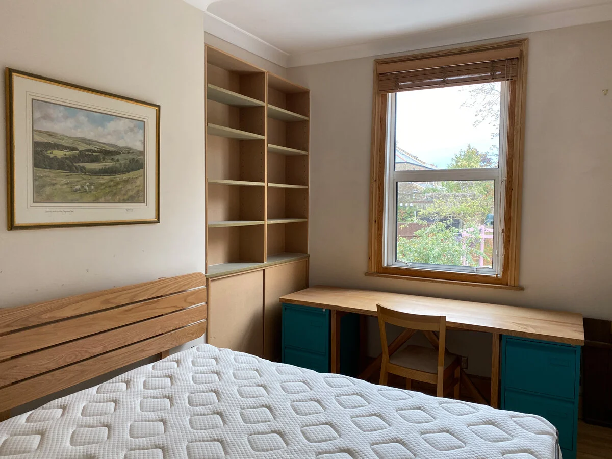
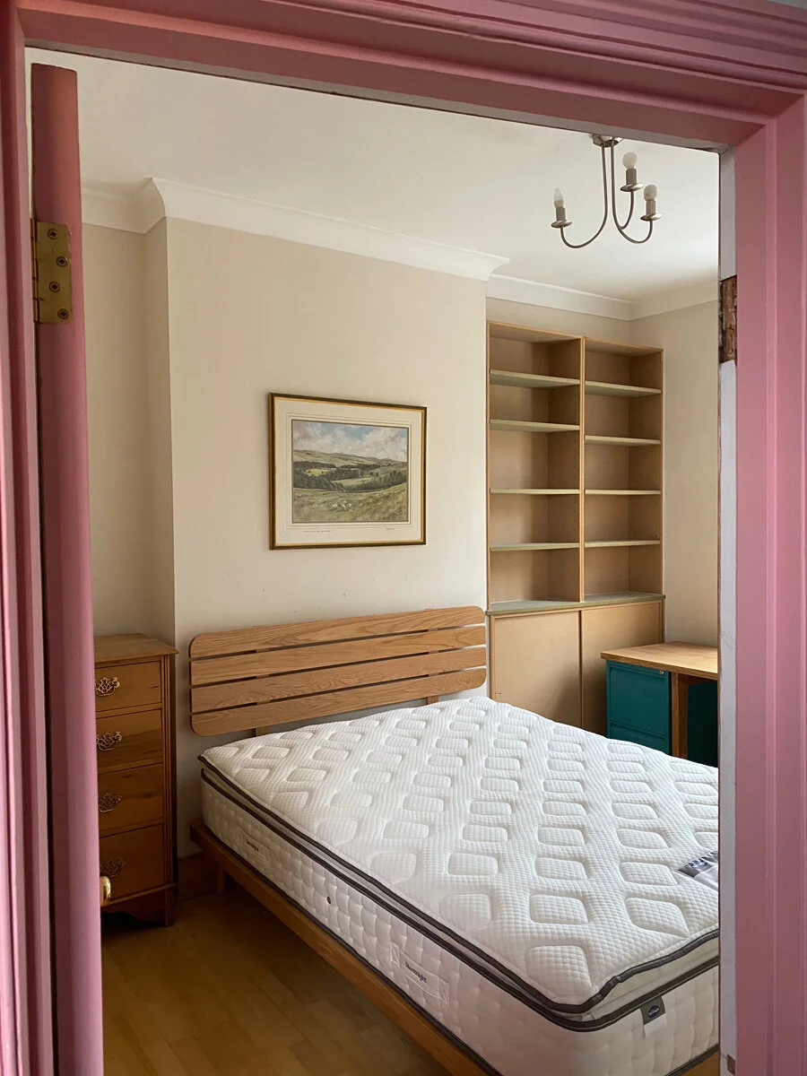
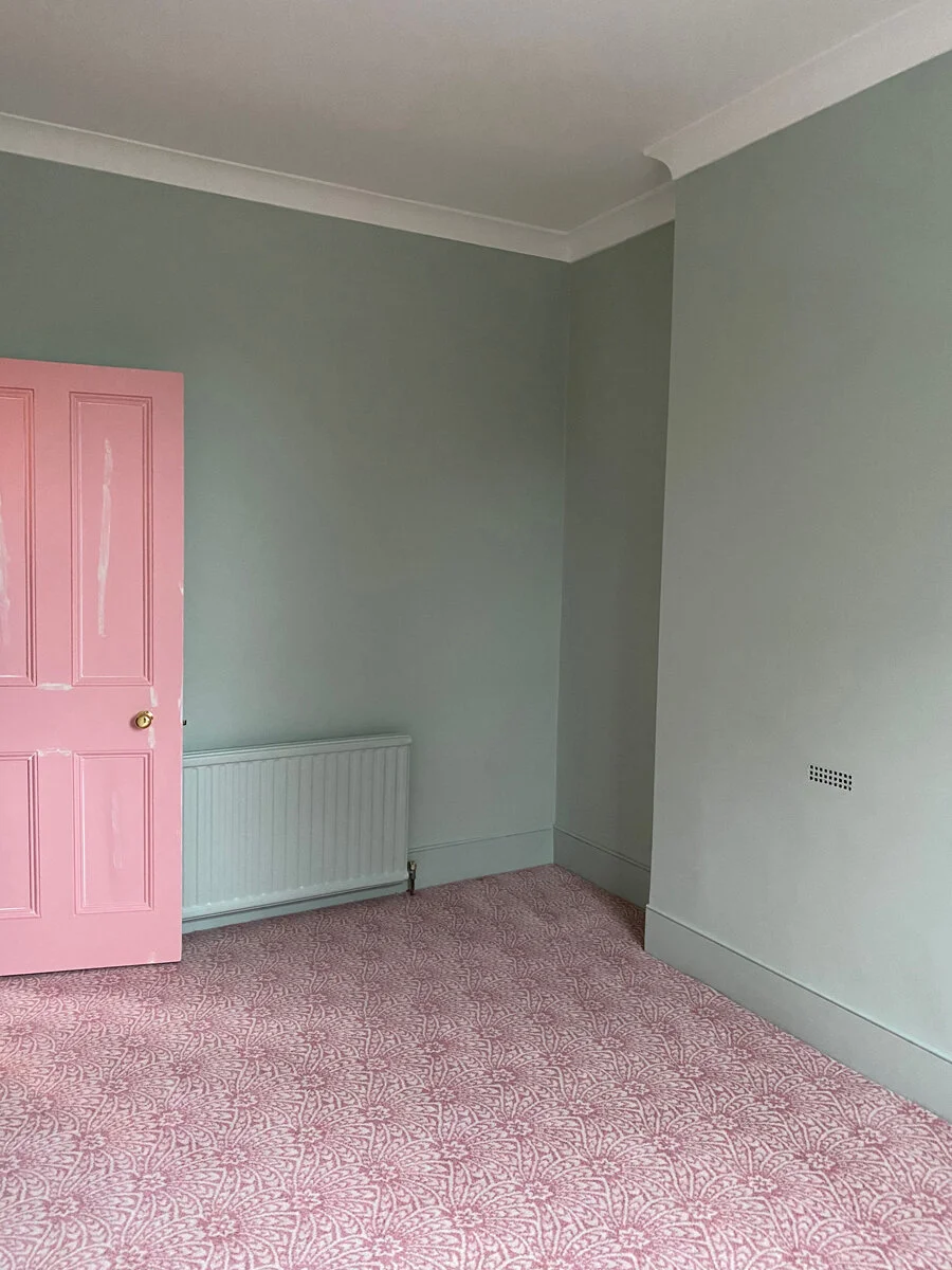
The guest room/study before the revamp
It’s a small room with lots of things in it
THE BRIEF
And so I decided to take the plunge and decorate the room. But where to start? As this is, ostensibly, the Pink House Husband’s room, he provided me with the initial brief. This was limited in scope and centred largely upon what he DIDN’T want:
The Pink House Husband’s brief:
No pink
No pattern on the walls
Nothing fancy on the bed
No bright colours
I also already had most of the furniture for the room:
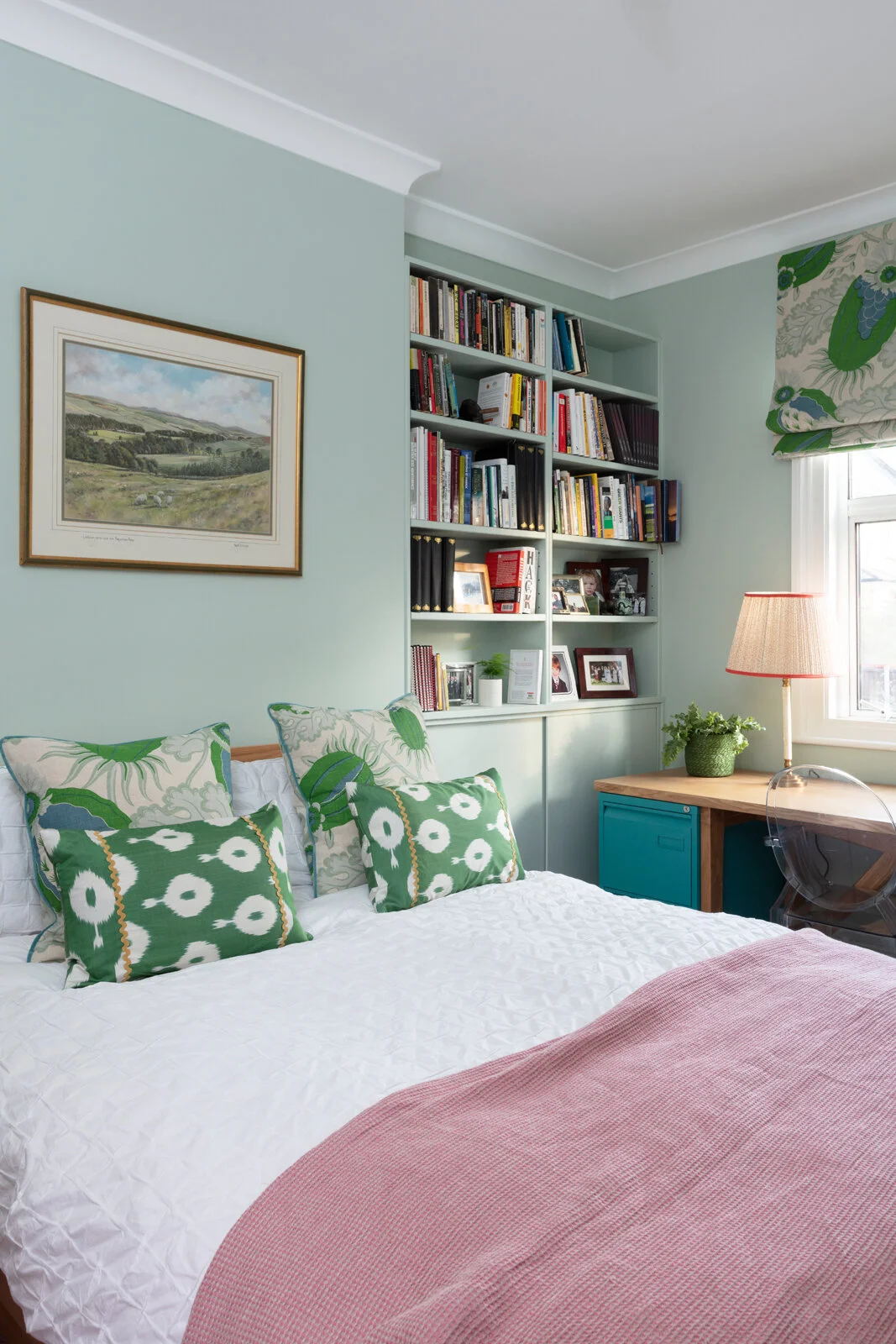
An attractive wooden slatted bed from one of my favourite brands/best clients John Lewis & Partners that I was given as part of an ongoing partnership with them
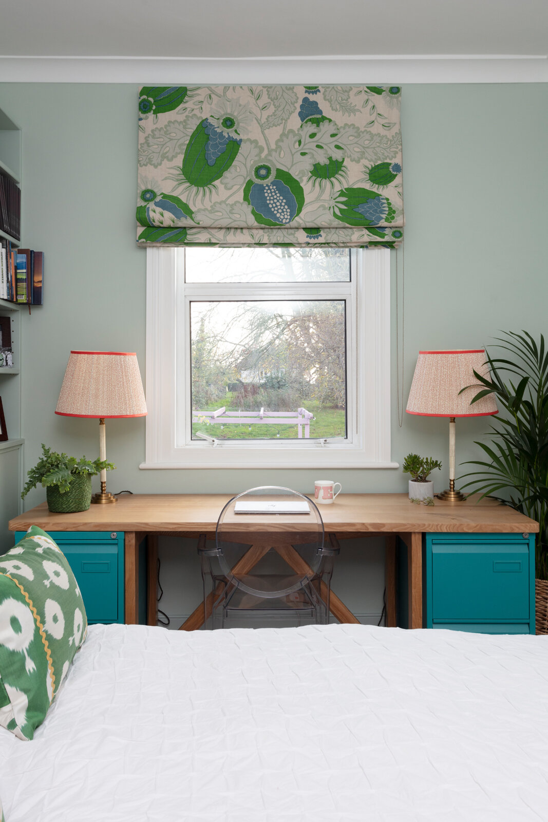
The bespoke desk that was made for PHH by a carpenter in Edinburgh, and the John Lewis turquoise filing cabinets that the desk had been made to fit over
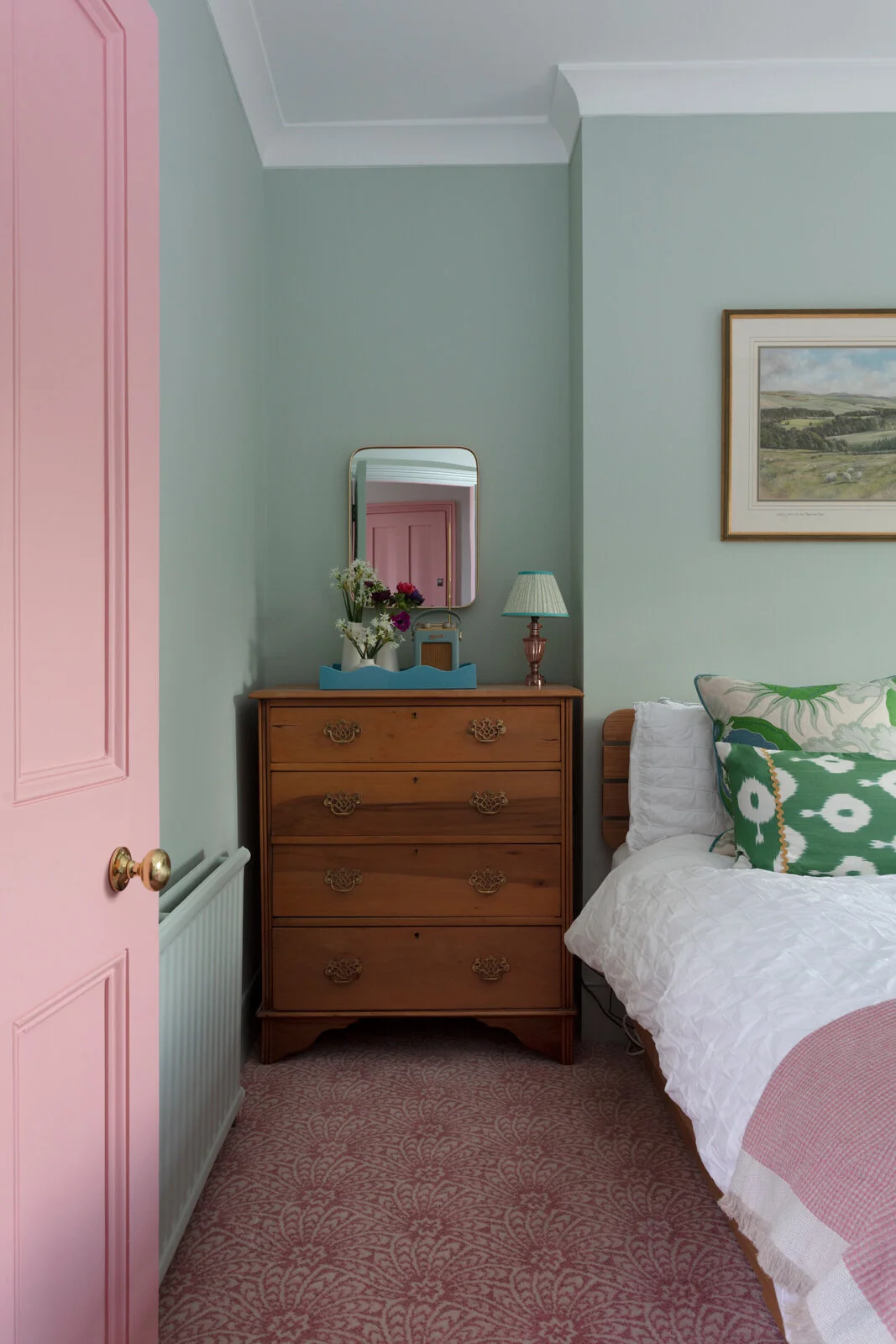
A vintage chest of drawers
Earlier this year we also had our carpenter fit bespoke MDF shelving and cupboards in the alcove, to house the husband’s books and work stuff and make the most of the limited space in the room.
THE STARTING POINT
But perhaps the most important item in the room was the picture of the rolling hills around where the Pink House Husband grew up on a farm in the Scottish Borders. It’s all soft green fields and watery blue skies, which, together with the other pre-existing shot of colour in the room, the turquoise filing cabinets, provided a starting point for the colour scheme.
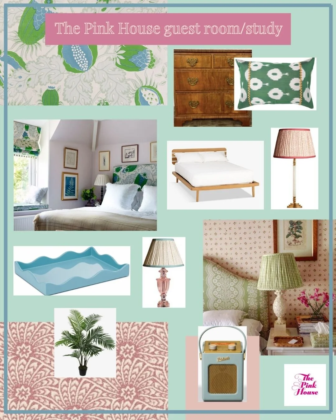
That’s when I remembered the box buried deep in the basement. When we moved from our Edinburgh home, I brought with me the couture curtains that had been created to fit the windows in our luxurious downstairs den. I was loathe to leave them behind, partly because they cost an eye-watering amount of money, and partly because I was hoping to be able to reuse the fabric one day. Said fabric is Carnival by Christopher Farr, the same sexy stuff with which our sitting room sofa bed is upholstered.
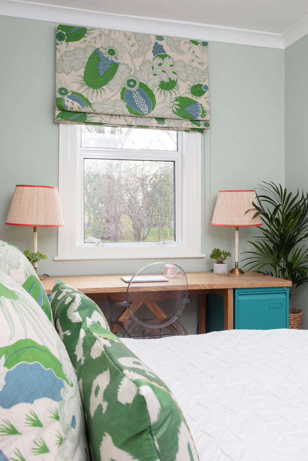
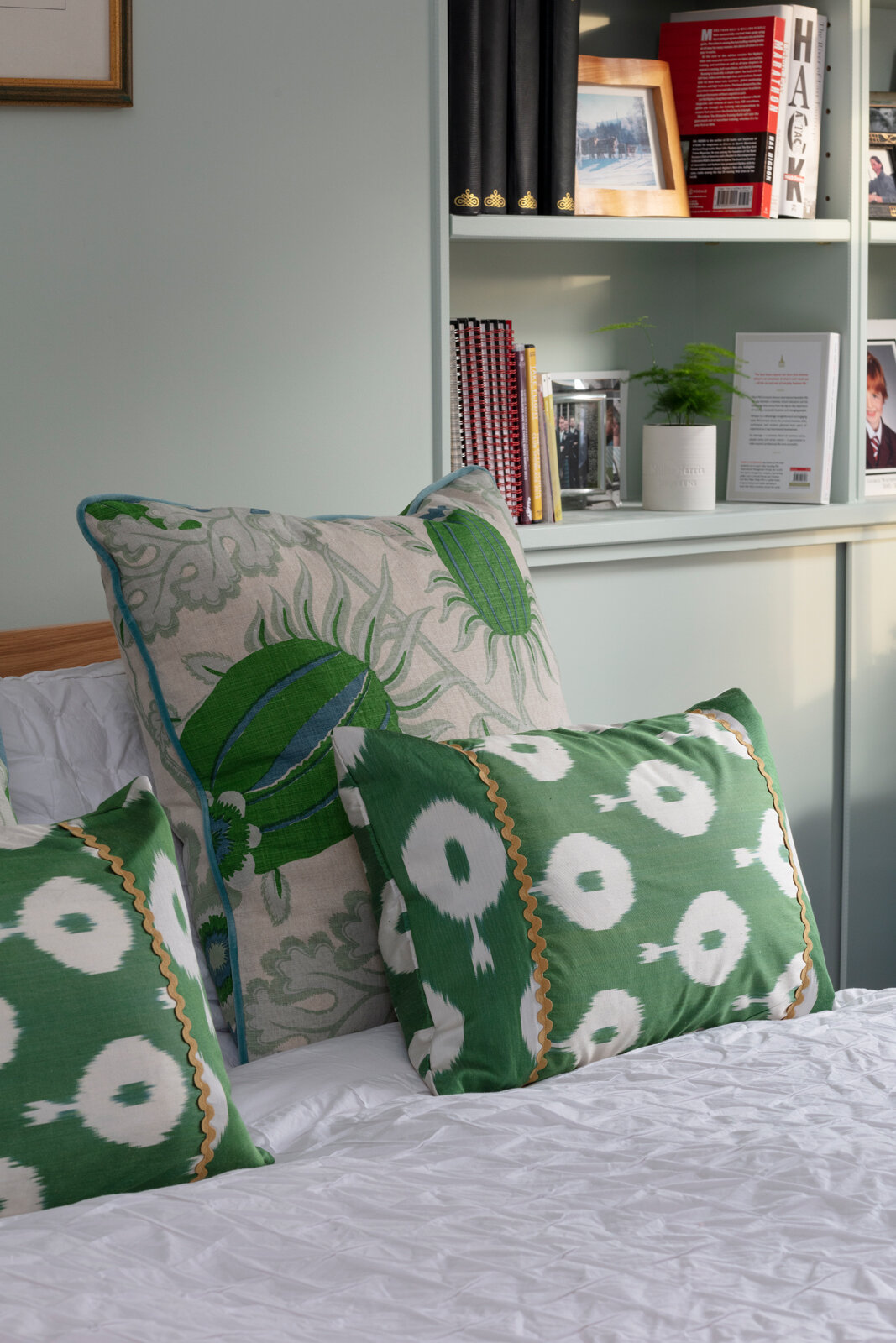
And so I unearthed the curtains from the box, which were luckily still in excellent condition, and got my curtain-making faves, The London Curtain Girls, to turn them into a roman blind and two large cushions, piped with the blue velvet fabric that trimmed the original curtains. Fabulous! Even the cushion-hating PHH had to admit they looked good.
Cushions behind by The London Curtain Girls using Christopher Farr Carnival fabric/Green Ikat cushions from Polkra
Mary and Laragh from The London Curtain Girls also knocked up a sheer eau de nil roman blind to layer under the thicker Christopher Farr one. This does the all-important job of filtering the sunlight as PHH has his desk in the window and the window faces south. They created something similar in pink for my south-facing office and it works a treat and looks lush.
THE BIG DECISIONS
Pink Alternative Flooring Capello Shell carpet on the floor and Farrow & Ball Teresa’s Green on the walls. Door painted Pink House Pink by Mylands
That still left the big decisions of a) what colour to paint the room, and b) what to put on the floor. The latter was decided first, thanks to a conversation with Alternative Flooring, who have supplied all the carpet in The Pink House, including the stripey stair runners, the black-and-white honeycomb carpets in the kids’ rooms, and – my favourite – the pale pink Liberty Capello Shell design in my bedroom.
I checked PHH’s brief again. No mention of a pink prohibition on the floor, I noted. And Alternative Flooring were happy to supply me with sufficient quantities of the same coral pink Capello Shell carpet used in my bedroom. I made the decision without informing my client, because there are some things that clients simply don’t need to know.
And so the actual colour of the room was one of the last things to be decided, which is quite an unusual way for me to design a room. But it really worked, because I could ensure that it tied all the other components together. Initially I’d considered a brighter, more verdant green, but as there was quite a lot of bold colour happening in the room already, I thought a softer green would be more relaxing, and wouldn’t compete with the Scottish countryside picture, which was after all the starting point for it all. Farrow & Ball do a great range of greens, and the minty Teresa’s Green worked beautifully with all the other elements. Happily, the client approved. Decision made!
FINAL DETAILS
Now it was just the lighting and a few other details left to choose. Pooky has been my lighting go-to for years now. I love the patterned shades (and the fact that they remind me of my second home, Soho House) and range of bases, and the way their well-designed website makes it really easy to mix and match different elements then see how they’ll look with the light both on and off.
The pair of Pooky lamps give the small room a luxe, grown-up feel
I chose a pair of tall matching lamps for the desk, not only for practical illumination reasons, but also because I liked the way that this gave a luxurious country house sitting room vibe, which I thought would be nice for guests. The tiny bedside lampshade matched the coral pattern of the desk lamps, but in an azure that mirrored the piping on the cushions.
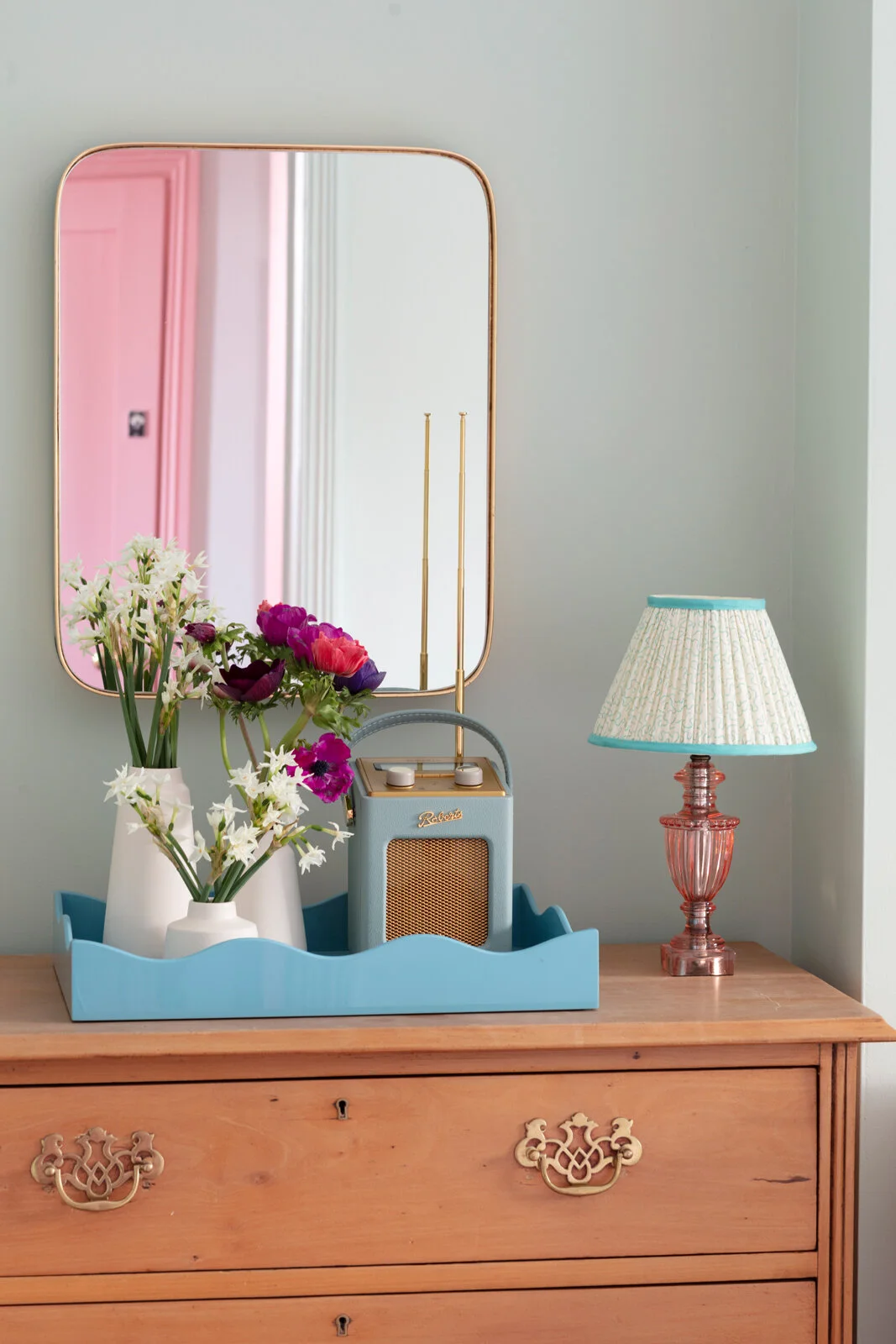
Finally, I treated myself to a wavy lacquered Rita Konig tray to house a duck egg blue Roberts Radio, and added a couple of plants. A curved-edged mirror above the chest of drawers is there for guests – I know it makes all the different having a mirror in my room when I go to stay somewhere.
Rita Konig x The Lacquer Company wavy tray and duck egg Roberts Radio
When dressing the bed I thought it looked best with a fresh pin-tucked white duvet cover and pink linen throw. Plus the bespoke cushions paired with my beloved emerald green silk Ikat cushions from Polkra that I stole from the sitting room.
THE VERDICT
I’m so happy with the finished room. It feels cosy and luxurious with a bit of a comfy country house vibe. And it’s practical both for PHH to work in, and for guests to stay in, when the Covid crappiness has finally subsided.
But did the client love it? I’ll leave the final words to the Pink House Husband: “Yeah, it’s alright.”
The room is ready for guests/the Pink House Husband’s Zoom calls
CREDITS
[Gifted products marked * ] Carpet: Capello Shell, Alternative Flooring | Paint: Teresa’s Green, Farrow & Ball | Bed * : Bow Slatted Kingsize, John Lewis & Partners | Blinds and cushions: made by The London Curtain Girls using Christopher Farr Carnival fabric | Green cushions * : Polkra | Tray: Rita Konig X The Lacquer Company | Radio * : Duck egg Revival Mini DAB, Roberts Radio | Linen throw : Chalk Pink Linen Company | Brass mirror : Cox & Cox | Lamps * : Pooky | Pink paint on door * : Pink House Pink, Mylands

